 Sean Clark
Just finished up a chapter on politics in Africa, this time focusing on communications technology, political competition, and a bit of economic development. As usual, there were a lot more graphs than could fit in the final product.
What follows are a bit of a random collection, but hopefully useful to the reader nonethless. They were created on Stata and all the associated data is up on the 'Academic Details - Datasets' page. Sources follow in the captions below.
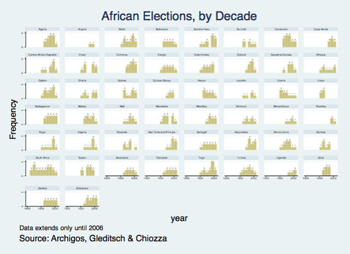
An interesting look at the growth of elections in Africa, broken down by country. Data from the Archigos dataset, which is primarily concerned with political leadership but offers some election data as a bonus (though only until the mid-2000s).
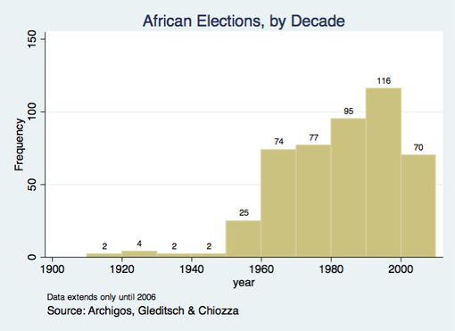
A clearer look at the boom in African elections in the 1980s and especially the 1990s. Note, however, that many longstanding autocrats and their coteries won these polls handily. Mobutu, for example, always comes to mind as someone who weathered the democratic storm rather well.
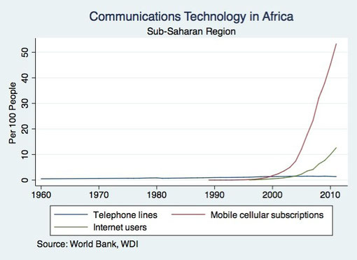
An interesting look at communications technology from the World Bank's 'World Development Indicators' data. Basically, nobody in Africa ever used a telephone, the internet has a long ways
to go, and the continent's story of the wireless telephone is one of the most incredible in history.
I always think of how I never owned a cell phone until after I moved to Uganda in 2004.
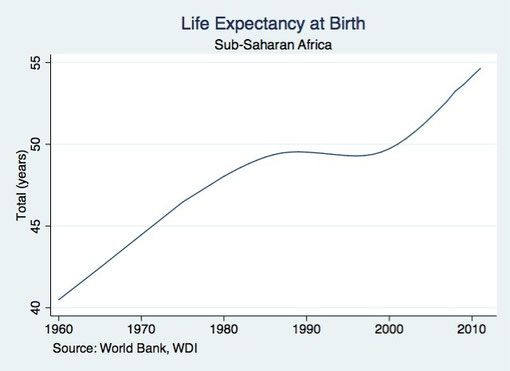
This graph is interesting for two reasons. The first is that it shows how economic calamity has real, human consequences. Sub-Saharan life expectancy not only slowed down in the 1980s and 1990s, but actually declined. That takes MASSIVE social upheaval, particularly in an era of such abundant scientific and medical knowledge.
Second is that politics and economics have serious lag effects. Africa's economy had reached rock bottom by the early 1980s, yet the enormity of the problem wasn't realized until about a decade later. The implication is clear: screw up now, and you can make people pay for a long time into the future.
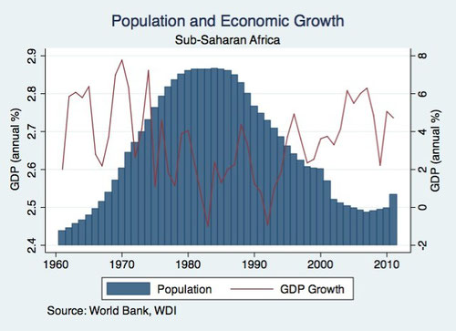
This graph is a bit misleading because the two scales are different, but is interesting to see the fluctuation in aggregate growth rates for population the economy nonetheless.
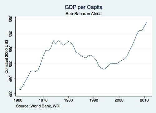
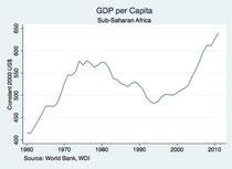
A little clearer look at the economic calamity that befell Africa. By 1980, misguided state-directed industrialization and widespread kleptocratic leadership had brought these countries to their knees.
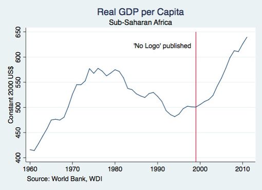
I've posted this graph before, but the lesson is worth reiterating: never EVER listen to Naomi Klein.
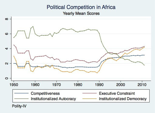
Good look at the level of political competitiveness since decolonization. Two things of note. First is the rapid decline in outright democracy that started in 1989. Second is how other measures demonstrate a much less pronounced transformation, even regressing a bit in the latter aughts.
The inference here is that just because a dictatorship is no longer legal, there's no reason to assume said dictator will slip quietly from the stage.

Write a comment